Interface designers
When you need to design a screen you have not built before: settings, an empty state, onboarding, pricing. Rather than inventing from scratch, see how dozens of products solved it.
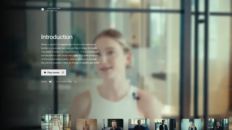
A reference of interface decisions
498 products and 102,609 screens from real interfaces — filtered by category, UI pattern, screen type and colour.
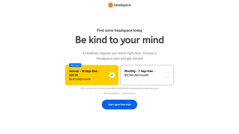
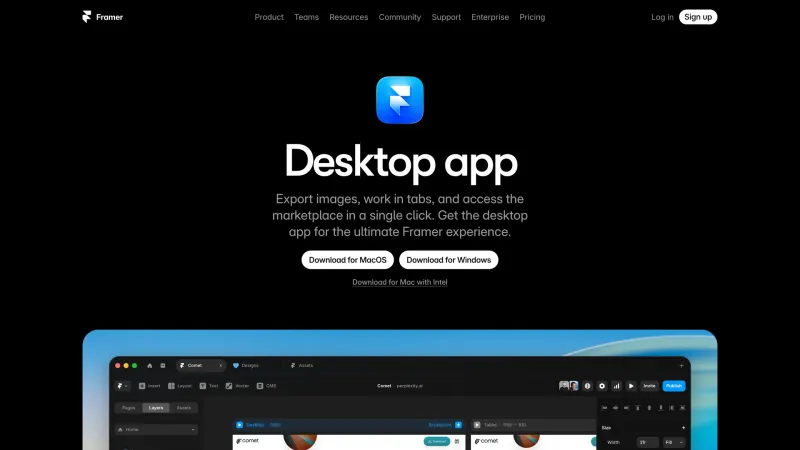
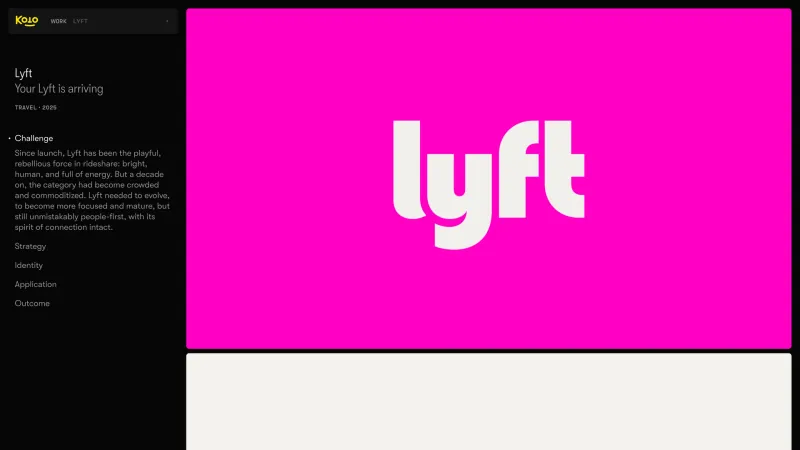
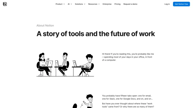
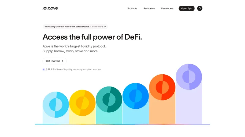
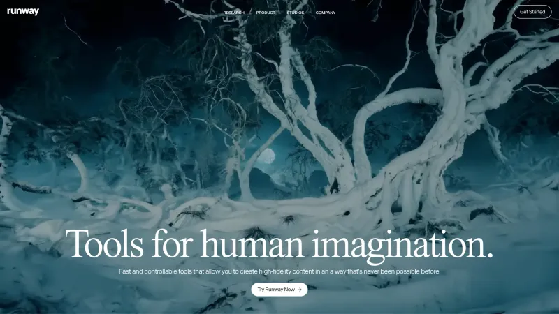
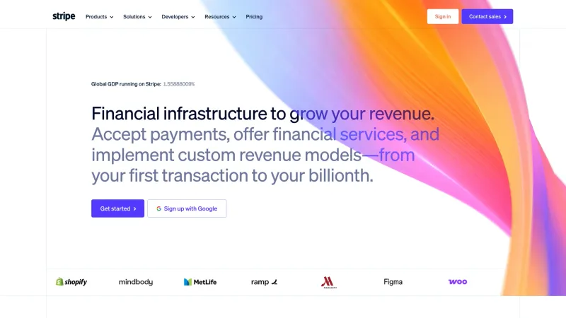
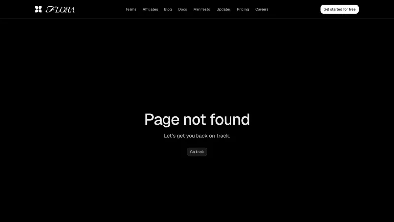
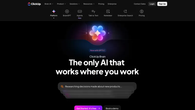
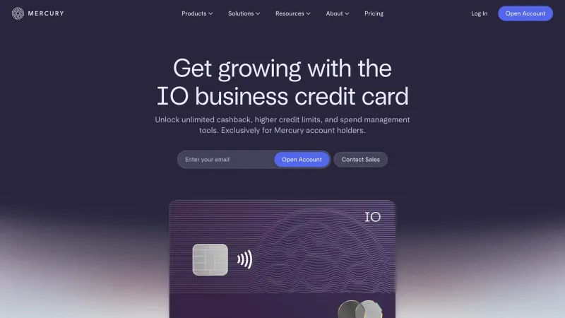
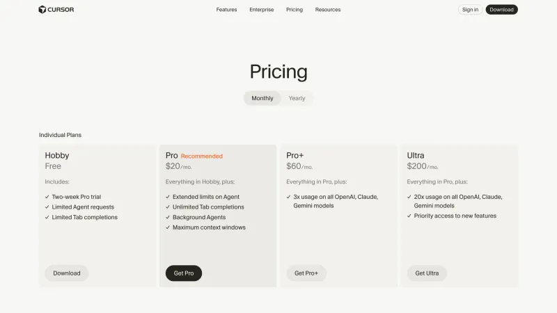
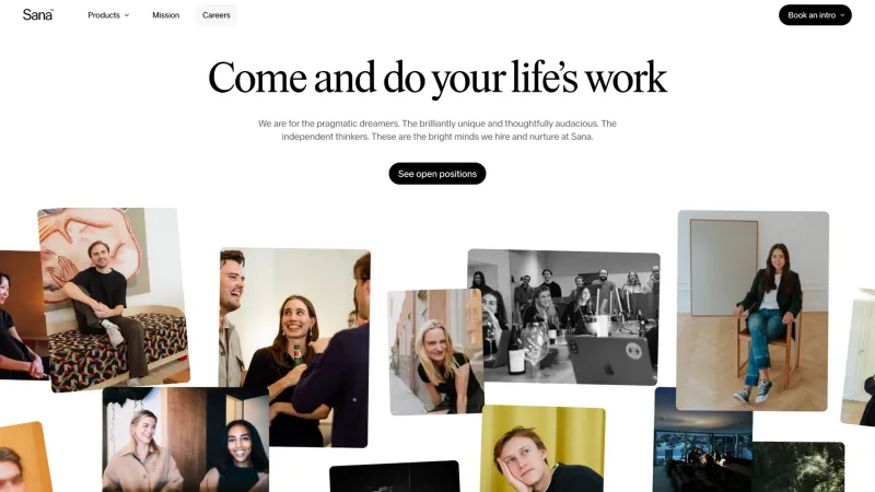
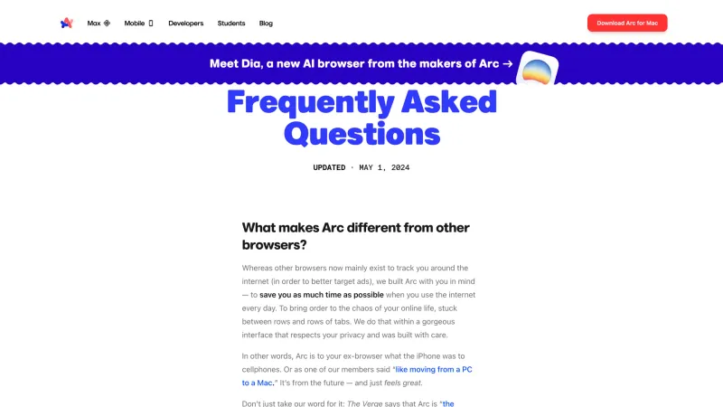
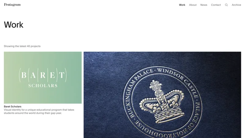
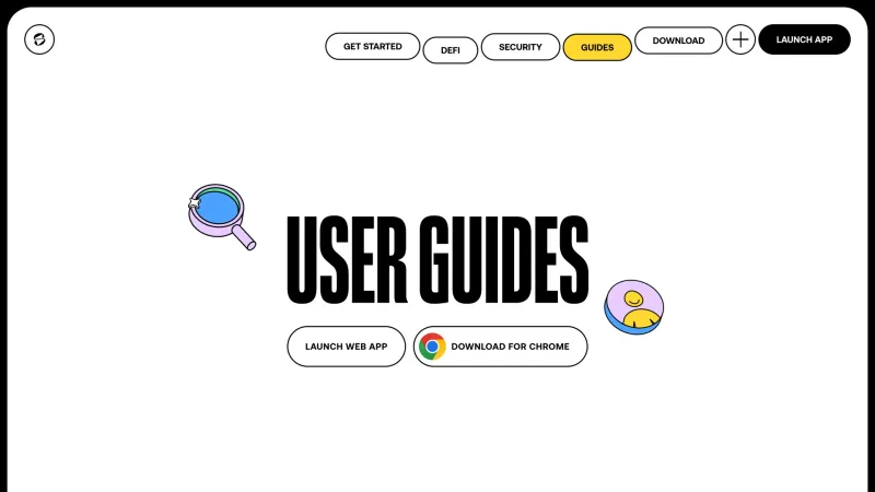
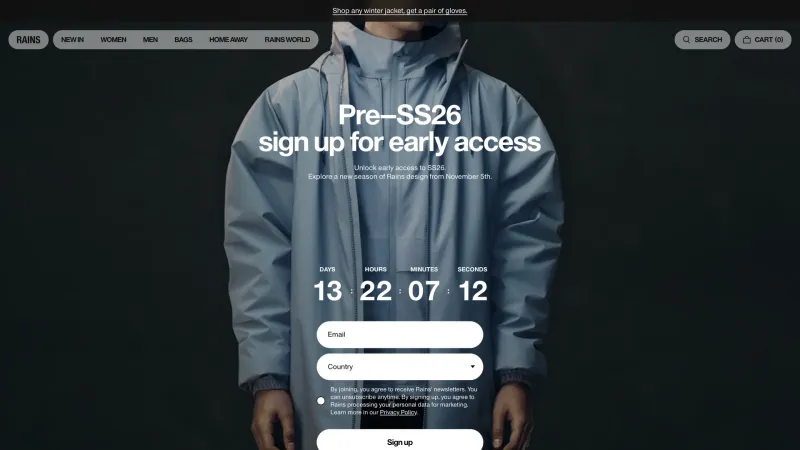
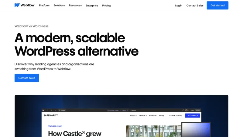
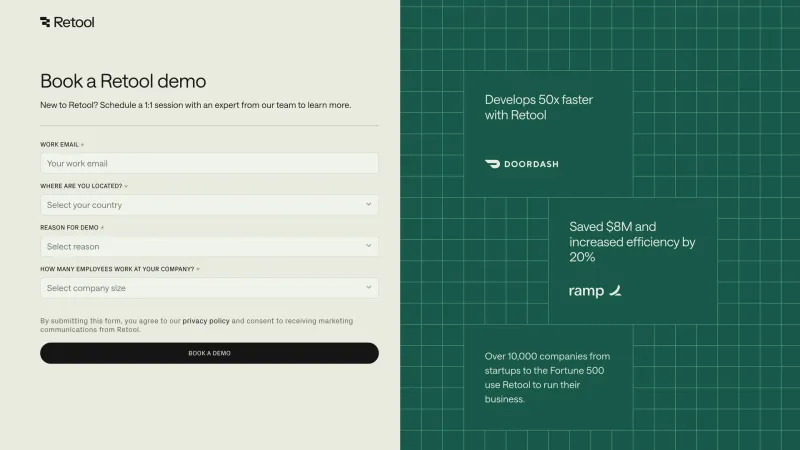
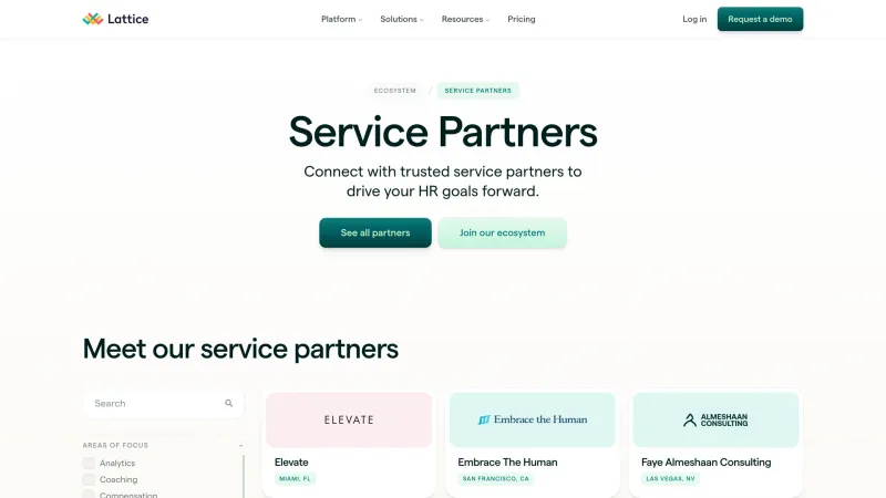
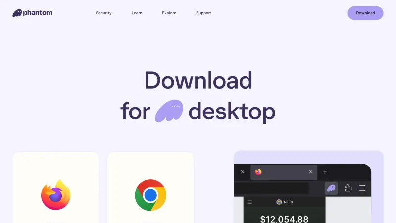
When you need to design a screen you have not built before: settings, an empty state, onboarding, pricing. Rather than inventing from scratch, see how dozens of products solved it.
Showing beats describing when the team needs to understand the intent. Assemble real examples and attach them to the brief.
Full-size frames show spacing, density and typography — closer to markup than an abstract mockup.
Before redesigning a landing page, see how hero sections, pricing blocks and FAQ layouts work in your own category.
One screen is interesting for different reasons, so it carries several coordinates. The section answers "what is it": web app (184), website (199) or iOS app (115).
The industry a product belongs to. Useful when you need examples from your own niche: fintech, health and commerce carry different expectations.
Recurring ways to solve repeating problems: dashboard, form, sidebar, feed, kanban. The main axis when designing a specific screen.
Finer than a pattern: it describes not the whole screen but what is on it — hero, pricing, FAQ, footer, card, text field. On a project page it shows which parts of a product are documented before you open a single screenshot.
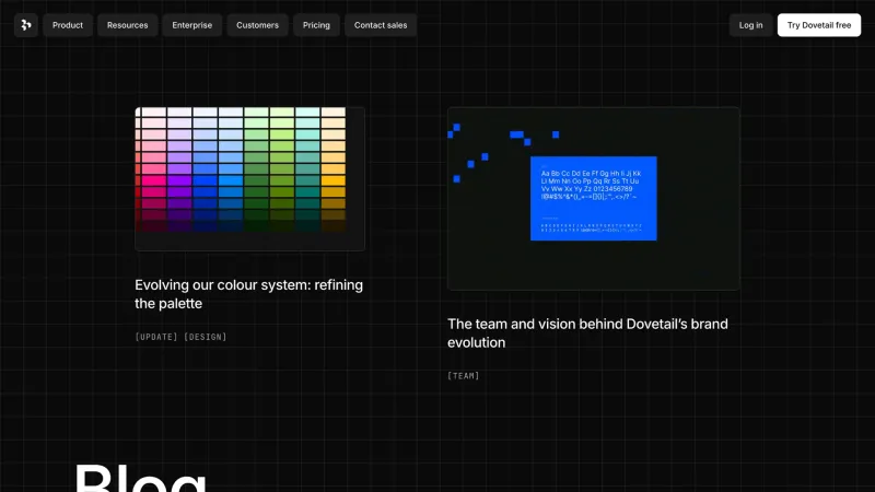
Every project carries a palette of three anchor colours, picked from the product's actual styling rather than by averaging pixels: averaging returns the background and loses the accent that occupies little area but carries the recognition.
The colour filter in the catalog selects by hue proximity. Non-obvious but practical: when a palette is already fixed, it helps to see how a similar range handles contrast and legibility.
By section, category, pattern, screen type and colour — at once, instantly.
Sites are captured as whole pages, top to bottom: the entire composition, not the fold.
Named sets stored in your browser and exportable as JSON.
Up to three screens side by side — density and hierarchy differences escape memory.
Any frame in one click: for a moodboard, a deck, a discussion.
The catalog switches between light and dark and remembers the choice.
Designing a settings screen? Start at the pattern page instead of hunting for a company. You will see dozens of solutions side by side.
Add a category: fintech and health design the same form differently, because the cost of an error differs.
Mark screens into a collection as you browse — then show the team all at once.
Put two or three near-identical solutions side by side. Density differences only show in direct comparison.
A moodboard ages quietly: six months later half the links point at a redesign and half the files sit unnamed and unsearchable. Here screens are labelled, products classified, and whatever gets looked for most is a filter. When a product changes its design the earlier frames stay, in a block of their own, because a previous generation of an interface is a useful reference too.